To See Is To Participate
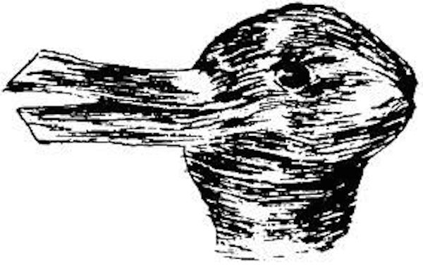
This image and the question it raises, “Is it a rabbit or a duck?”, embodies the subject of Art and Illusion by E. H. Gombrich. His introductory comments strike me as a clear summary of the trends in the teaching of modern art history that have inhibited the recognition of the achievement of Fairfield Porter.
Gombrich admires “the great artistic revolution” that swept across Europe in the 20th century. Representational accuracy was no longer considered to be a requirement for artistic excellence and this was a kind of liberation. Critics and art historians focused their attention elsewhere. An unfortunate side effect: “The impression has grown up that illusion, being artistically irrelevant, must also be psychologically very simple.”
Proponents of abstraction have often declared it a more advanced style because it challenged the viewer to participate.
In fact, whether the art is figurative or not, anyone who is looking is participating.
Well known books dealing with the complexity of vision:
Rudolph Arnheim Art and Illusion
Oliver Sacks The Man Who Mistook His Wife for a Hat
A viewer’s spontaneous and often emotional response to the art being observed is another aspect of participation. Fairfield Porter’s paintings are appealing to general audiences. His 1983 retrospective at the Boston Museum of Fine Arts was enormously popular. This did not significantly enhance his stature in art history circles. One might argue that it had the opposite effect. What self respecting scholar or museum board member wants to be associated with art that “uneducated” people respond to so enthusiastically? According to Hilton Kramer, the Whitney “…had to be coerced into accepting even an abridged version of the Boston show.” Only a few years later David Freedberg published The Power of Images in which he argues that an immediate response to the “magic” of images has been largely educated out of most art professionals. Even scholars who feel drawn to Porter are skeptical of their own impulses. Once abstraction became linked with “advanced thinking”, art that appeared to be immediately comprehensible became suspect.
But comprehension occurs on many different levels. The general public enjoys Porter’s appealing subject matter and beautiful use of color and is satisfied with that degree of engagement. Art historians, critics, and painters whose viewpoint has not been distorted by a dogmatic conception of modernism are able to appreciate Porter’s work in a more complex way. Here are a few examples.
The surprising thing, indeed, is that Porter’s paintings manage to seem realistic, for their process of construction often runs quite contrary to that of the forms they represent. Distant objects, for example, are often painted over the object in front of it, or a blue patch of distant sky splashed on top of an area of green foliage. Strange combinations of colors somehow convey the taste of reality. In Island Farmhouse, for example, the side of the house was underpainted a bright chrome yellow to represent the shadows, and the clapboards were then painted over this yellow surface in thick white streaks. Bright yellow shadows? Certainly a strange effect. Yet eccentric and unpredictable as they are, in Porter’s best paintings such manipulations of pigment and color somehow catch the authentic look and feel of things, going beyond knowledge of form to capture the immediacy of pure sensation. Henry Adams, “Fairfield Porter: Why the Fuss?”, Carnegie Magazine LVII/2 (March-April 1984) 12-14.
July Interior (1964) is a statement of more evident complexity. It is midday. A woman is lying on an unmade bed in a bedroom, surrounded by books, telephone, eyeglasses. Her head is at the center of the painting. From that point we move out in various directions. At right, out the window, is the July landscape. Beyond her body is a dresser. There are pictures, lamps, curtains, pink walls. The space is set up, one might say, by the great thrust of wall beginning at the lower right and pushing diagonally through the painting. But our experience of the painting denies this orthogonal: we go up and down, back and forth, over and around the figure. Our focus shifts from areas where objects are uninflected shapes to areas where the effects of light on surfaces—on dark, polished wood, on gold-colored metal—approach the singular truth of accidents in nature. Our experience of the painting moves between the opposing poles of depersonalized, undefined objects-as-shapes and highly personalized, intimately modulated objects-as-personalities. July Interior is a picture that touches on “big” questions: the nature of perception, of experience. Jed Perl, “Fairfield Porter” Arts 54 (February 1980): 4